The Opposite of Orange: Exploring Colors on the Opposite Spectrum
Colors play a significant role in our lives, evoking emotions and influencing our perceptions. One intriguing aspect of colors is their relationships with each other on the color wheel. In this article, we delve into the concept of color opposites and specifically explore the opposite of orange. By understanding the opposite color of orange, we can gain insight into color theory and expand our creative horizons.
1. The Color Wheel:
To comprehend the opposite of orange, we must first understand the color wheel. The color wheel is a circular representation of colors, showcasing their relationships and harmonies. It consists of primary colors (red, blue, and yellow), secondary colors (orange, green, and purple), and tertiary colors (yellow-orange, red-orange, red-purple, etc.).
2. Orange and Its Significance:
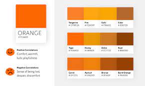
Orange is a vibrant and energetic color often associated with warmth, enthusiasm, and creativity. It is a blend of red and yellow, which makes it a secondary color on the color wheel. Orange is commonly found in nature, from the hues of a sunset to the vibrant tones of autumn leaves.
Orange
3. Complementary Colors:
In color theory, complementary colors are pairs that stand opposite each other on the color wheel. They create a strong contrast when placed side by side, enhancing each other's visual impact. The complementary color of orange is blue, which lies directly across from it on the color wheel.
4. Exploring Blue as the Opposite of Orange:
Blue, the opposite of orange, is often associated with calmness, tranquility, and stability. It is a primary color and represents the opposite end of the spectrum from orange. The stark contrast between orange and blue creates a visually striking combination that is frequently used in various art forms and design principles.

Blue and Orange
5. Color Harmonies and Their Applications:
Color harmonies are specific combinations of colors that create pleasing visual effects. By understanding the opposite of orange, we can explore different color harmonies that incorporate blue. Some popular harmonies involving orange and blue include complementary harmony, split-complementary harmony, and analogous harmony.
Complementary Harmony: Utilizing orange and blue together in equal proportions can create a vibrant and visually captivating composition. This harmony is often employed in graphic design, advertising, and branding to draw attention and evoke strong emotions.
Split-Complementary Harmony: In this harmony, instead of using the direct opposite color, a complementary color is combined with the two adjacent colors. For orange, the split-complementary harmony involves using blue-green and blue-violet. This combination provides a more nuanced and balanced visual experience.
Analogous Harmony: Analogous colors are those that lie adjacent to each other on the color wheel. For orange, the analogous harmony includes the colors red-orange and yellow-orange. By incorporating blue as the opposite color, we can create an analogous harmony that adds depth and interest to a composition.
Understanding the opposite of orange, which is blue, opens up a world of possibilities in color theory and design. The contrast between these colors allows for visually impactful compositions and harmonies. By exploring the color wheel and its relationships, we can expand our understanding of colors and enhance our creative endeavors. So next time you encounter orange, remember its opposite, blue, and consider the exciting combinations and harmonies that can be created by embracing the interplay of these two vibrant hues.